When I started Facebook advertising about 4 years ago, I honestly had no idea how Facebook advertising worked. Not to mention Facebook ad design.
Later, I’ve seen many ad campaigns get signed up that sometimes result in 200% and perhaps higher CTRs and conversion rates. I’ve even been to some.
Frankly , I don’t think many people have the slightest knowledge of starting Facebook ads . Unless, of course, he took lessons for it.
Even then, Facebook Ads Manager will blow your mind, making you not know what you’re doing.
He has such a habit. Because Facebook, which is an advertising tool that changes day by day, wants its users and advertisers to keep up with it. But that’s not all, there are some tips that you can apply in your Facebook ads that never change.
Those are the tips that I will share with you in this guide. Exactly 25 Facebook and Instagram ad design hacks (hacks) that I have proven correct for you and that we use will be waiting for you in this guide.
Expect to see tons of case studies, A/B test results and success stories, and you can apply them all to your own Facebook ads design campaigns. Of course, do not forget to share the results of these with us. 🙂
So, if you’re ready, let’s get started.
⭐If you want to learn about more topics, you should also check out our other articles about Digital Marketing . 😉
Facebook Ad Design Has A Very Important Place
A Facebook ad image can drive your campaign up or down. This is the power that an image holds.
It is especially important to pay attention to Facebook image sizes. Because ads will ask you for images of certain sizes.
Consumer Acquisition has found that images are arguably the most important part of their advertising. They are responsible for 75%-90% of ad performance. Do not forget that people began to take a great interest in visuals rather than texts centuries ago. In the same way, social media consists of images that attract the most attention of people.
If your ad image fails to attract attention, no one will read the ad copy.
That’s why it’s essential that you constantly A/B test new Facebook ad designs to find a winning solution .
Are you asking if all these various ad designs really have different click-through rates and conversion rates?
Be sure there is!
Here we share with you an example of three different Facebook ad design performances.
So, I suggest you create your first highly converting Facebook ad design campaign and try it all out in a quick A/B test.
And then, once you’ve tested enough ads and adapted them by following the best design tips, you’ll have an ad that people won’t want to do but click or interact with.
Facebook Ad Design Tip #1: Use Colorful Facebook Ad Images
If you’re thinking of having an eye-catching ad on your Facebook news homepage, it’s obvious that your competitors and many others fill this space with photos and still images. You need to reach your target audience by standing out from all this visual pool.
Creating a colorful ad that catches people’s eyes is the best way to grab their attention.
And what if we say you don’t even need very good Photoshop skills to do it?
How would you like to look at the OptinMonster share below together?
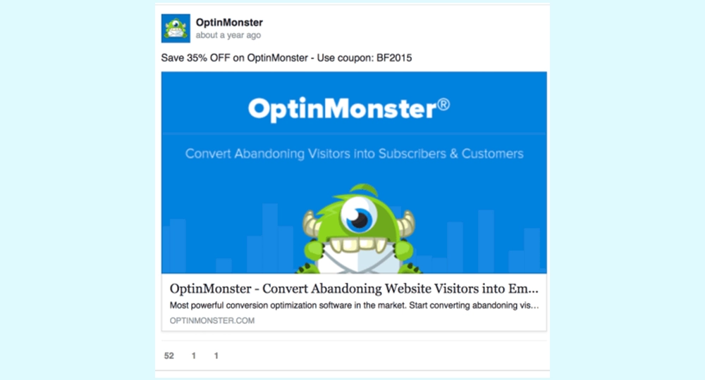
Research shows that people in your target audience form their minds within 90 seconds of their first interaction with people or products . It has also been determined that approximately 62-90% of their evaluations are based on colors only. So believe it or not, the last image you saw and caught your attention probably caught your attention because of its color.
If you are not sure which color to use, you can:
- Preserve your brand’s corporate colors
- Choose according to color psychology and color theory.
- Test between 3 and 5 different images by doing A/B testing
The New York Times is constantly testing new Facebook Ad Design colors to avoid ad fatigue and appeal to more people.
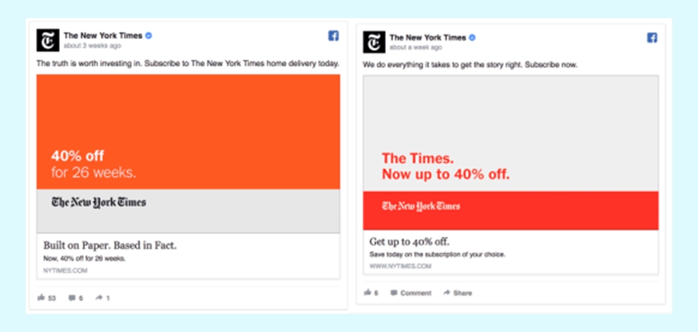
If there’s one more thing you should know about color Facebook ads, it’s that it brings us to my next suggestion.
Facebook Ad Design Tip #2: Use High Contrast Colors
A study by UsabilityTools shows that using high-contrast landing page call-to-actions results in a 75% higher click-through rate compared to a low-contrast CTA.
High contrasts will help draw more attention to your ad.
Take Nike’s ad, for example. It attracts attention immediately in the carousel (loop) advertisements that it uses contrast.
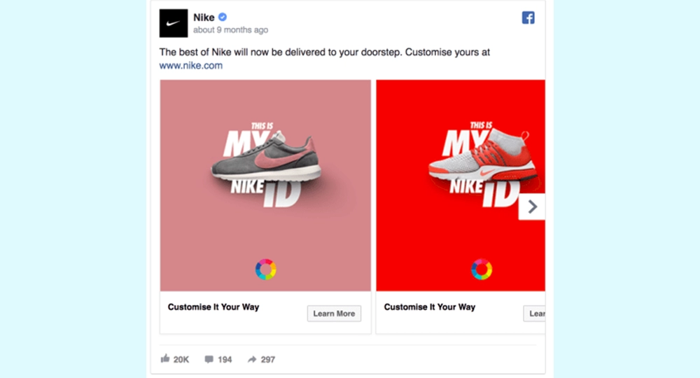
But sometimes, the contrast you’re looking for won’t be the contrast between creatives. You can also create Facebook ads that contrast with the entire news feed. This way, you will stand out among all those shares. Then we can move on to my next Facebook Ad Design proposal.
Facebook Ad Design Tip #3: Create Ads That Contrast With The Whole News Feed
We once did an A/B test to see what was best. We competed an ad with a white background against a colored red ad.
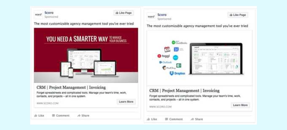
We discovered that the ad with a white background has a 60% higher CTR and 40% more conversions for the same budget.
Of course, there are other aspects that may have contributed to the success of this ad. However, as we continue to use this ad design with new ad copy and CTAs, it has yielded great results for the months ahead.
Here’s another example from Squarespace . Combined white picture background with colorful icons. This made the ad easier to spot.
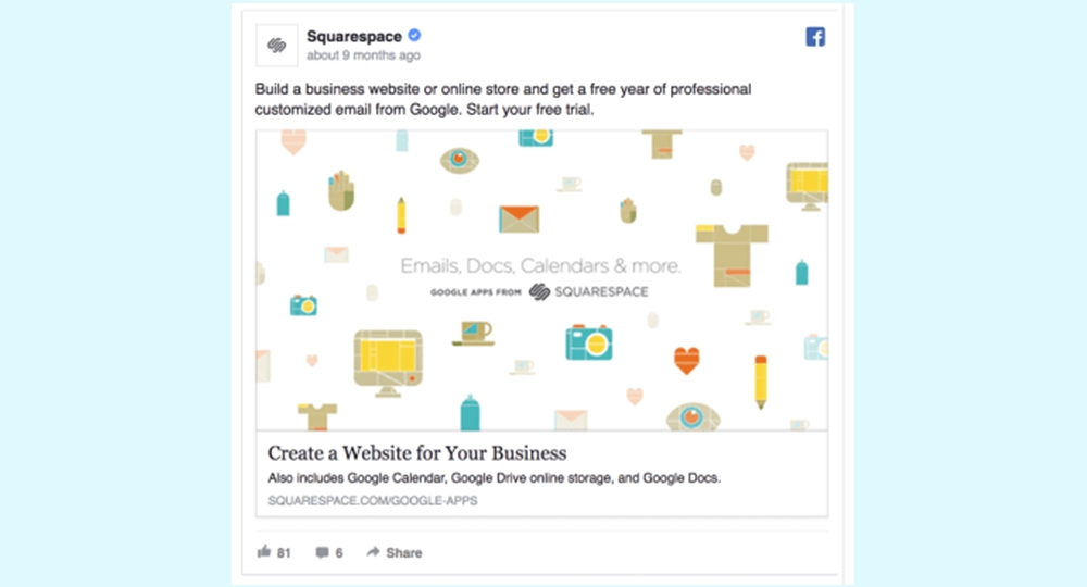
Here’s my advice: Test creating Facebook Ad Design images with white backgrounds; It’s sure to set you apart from other Facebook advertisers.
Facebook Ad Design Tip #4: Add Your Value Proposition to Your Ad Image
If your ad image is the first thing people notice, it makes more sense to place your key message inside the image.
Make sure the text on the ad image is short and engaging.
For example , upwork uses copy of the “Find Your Perfect Freelancer” ad, placing their UVP in front of the ad viewers’ eyes
Facebook Ad Design Tip #5: Keep the Text Over the Image Short
Facebook doesn’t like ad images with too much text on them, and if your image has too much text on it, your reach will be low. It may not even be published at all.
Instead of classifying Facebook Ad Design images as “Yes” or “No”, your ad’s text density will fit into one of four classifications:
- OK
- Low
- Middle
- High school
You can test your ad’s classification using the Facebook Text Overlay Tool .
⚠️The point you should pay attention to here is that Facebook uses grids when examining the classification of texts. If you’re using more than 20% of this grid, your ad will cease to be good. In other words, you can fit as much text as you can within the accepted limits.
The good thing is that Facebook sends email notifications to advertisers and directs your attention to text-heavy ads.
Facebook will notify you by e-mail, or if you already spend most of your time in this interface, you will definitely see it.
Facebook Ad Design Tip #6: Use Emotional Images
I bet you’ve never thought of using ad images that make people emotional, especially if you’re in the B2B business.
However, there is plenty of evidence to reconsider.
An analysis of 1,400 case studies of successful ad campaigns found that campaigns with purely emotional content outperformed those with only rational content (31% versus 16%) .
There is no limit to the emotions you can put into the game such as excitement, sadness, happiness, sadness, surprise. Make sure the sentiments match your ad’s offer. If you manage to use the right emotion for your business, you can use it much better than a rational message and image.
Eventbrite’s colorful ad image shows people at a concert, stimulating a sense of fun and belonging. This trend can also be seen in many Instagram ad examples .
Trend Hunter Marketing analyzed 55 emotional marketing campaigns and determined that the average popularity score was 8.0 higher than in other campaign categories.
Consider testing an emotional image the next time you add new ad designs to your Facebook campaigns.
Facebook Ad Design Tip #7: Use the Right Image Sizes
Make sure your Facebook Ad Design image is at least 1200 x 628 pixels wide (standard size) and that colors appear stable on all screen types.
While Facebook also allows advertisers to upload images in different sizes, following the guidelines is a surefire way to make sure their ads look good on every screen.
In many advertising areas, the image sizes requested by Facebook vary. If you want to get more information, you can also visit our guide where you can find all Social Media Image Sizes.
Facebook Ad Design Tip #8: Use Symbols Correctly and To Your Benefit
Studies show that people rely on emotions rather than information to make brand decisions. As you add a symbol to your ad image, users associate your brand with the symbol’s meaning.
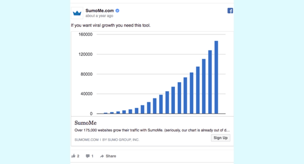
Here is this commercial image of Sumo is definitely my favorite example. A growth chart is displayed in their advertisements, which helps their products to be fully achieved. Thus, the traffic coming to your website will have a higher rate.
SaneBox’s Facebook Ad Design uses Gmail icons so users can immediately associate their products with email.
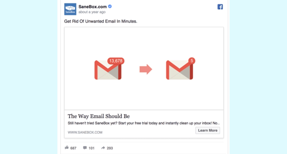
But that’s not the only reason SaneBox uses the Gmail icon. They also take advantage of the fact that people recognize a popular brand they already trust.
Facebook Ad Design Tip #9: Include Well-Known Concepts And Logos
Remember when we talked about the extremely well-performing Facebook ad?
Another reason it brings a high return on investment is that it contains many popular brand logos : Dropbox, MailChimp, iCal…
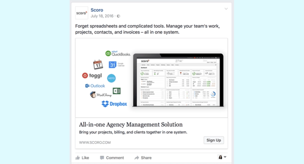
Studies show that our brains prefer well-known brands. If your product integrates with other popular tools or collaborates with a well-known brand, show it in your Facebook ads.
Check out another clever example of 123 Reg using the WordPress logo in ad designs.
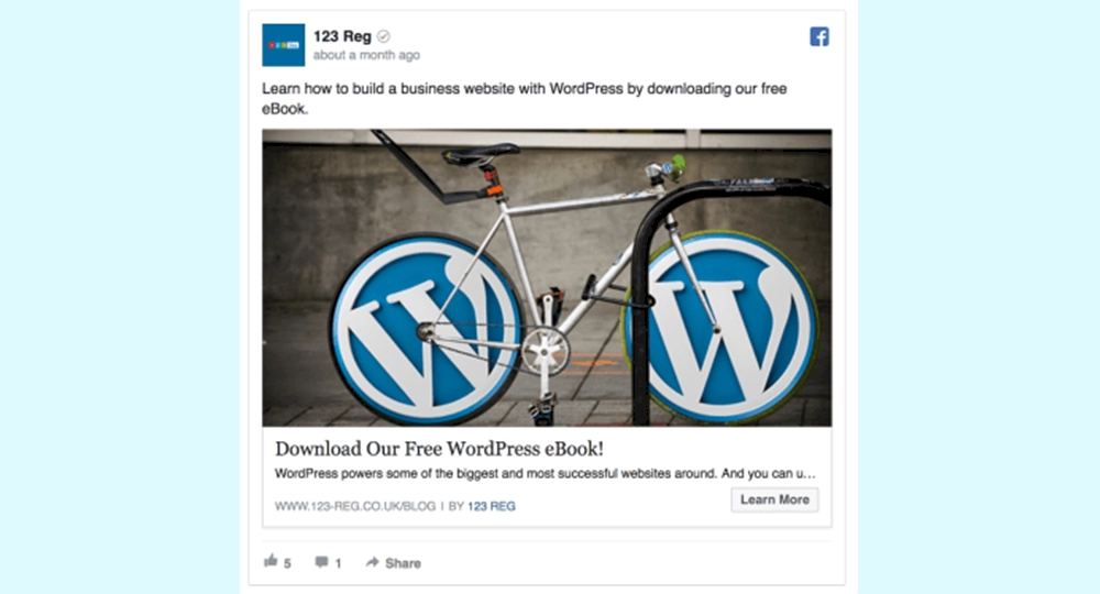
⭐When running a Facebook App Install ads campaign, add App Store icons to the ad image to indicate that you’re promoting a mobile app.
The simple Facebook ad recommendation of using well-known logos is hardly used. Test it and be among the first to benefit.
Facebook Ad Design Tip #10: Personalize Ad Designs with Person Images
According to research by Psychological Science, showing a smiling person in an advertisement image makes us feel happy, comfortable and safe.
Don’t limit yourself to person shots on your news feed pages. Try replacing an existing Facebook design with a picture of a happy customer.
Marketing Experiments show that using a real person associated with your product instead of a stock photo can increase conversions by 35%.
Here is an example by WordPress with a picture of a happy user:
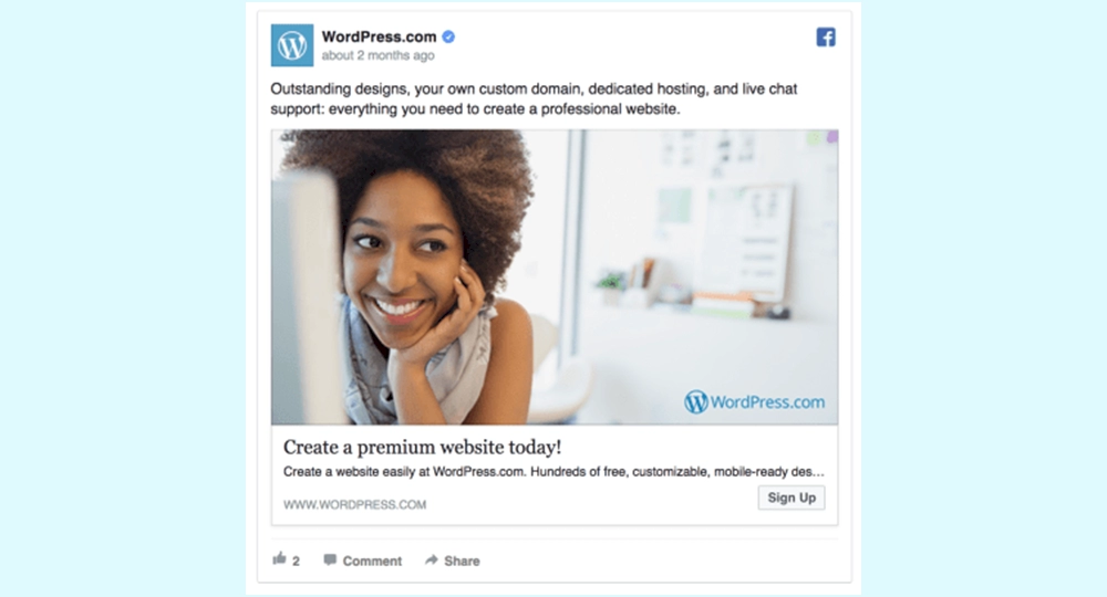
Facebook Ad Design Tip #11: Combine Personalized Contact Images with Text
If the person image you are using is only part of the Facebook ad image, there will be an empty space on the other side. Using this area in the most beneficial way, you can enrich it with a text written in the right language and containing a message.
According to Design Shack , the text on the image is read 200% more than the text shared with the images. That’s why advertisers should definitely use this space properly.
Facebook Ad Design Tip #12: Show Your Product As It Functions
People usually like to see what they are buying. Therefore, it makes a lot of sense to include your product in your ad.
A study by the University of Iowa compared our auditory memory to visual memory. It is our nature to remember what we see for a much longer period of time than what we hear.
To make people remember your products, you can place them in the ad image , just like NARS Cosmetics did.
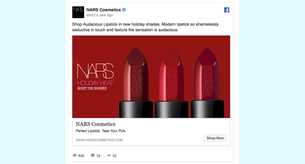
Displaying your product in advertising images is beneficial in many ways:
- Users can immediately see if they like your product
- If your product looks good, more people will click on your ads
- People start to imagine they are using your product and they are more likely to buy
- Helps you set users’ expectations based on what they’ll see on your landing page
- Helps increase brand awareness
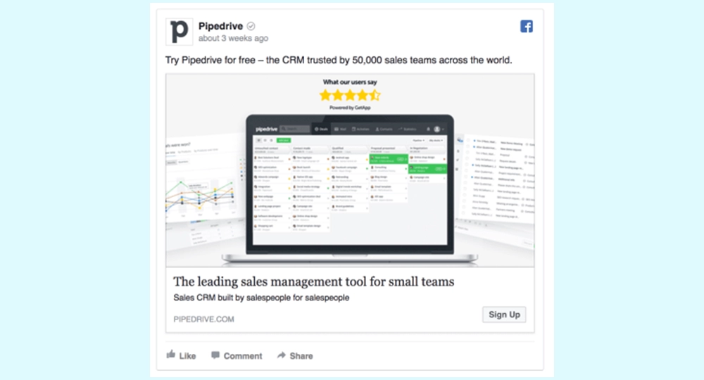
You don’t need to have a physical product to showcase in your Facebook ads. An online product can look just as good. Take Pipedrive’s Facebook ad, for example:
Facebook Ad Design Tip #13: “Show Before and After”
If your product needs to be unpacked or prepared in one way or another, you can include both stages in your Facebook ad.
It’s very interesting to show people’s brains before and after as it puts the whole story together. Turn your offer into a story with this simple Facebook ad hack.
Check out this Facebook ad example. It tells the story of taking a subscription package and turning it into a delicious meal.
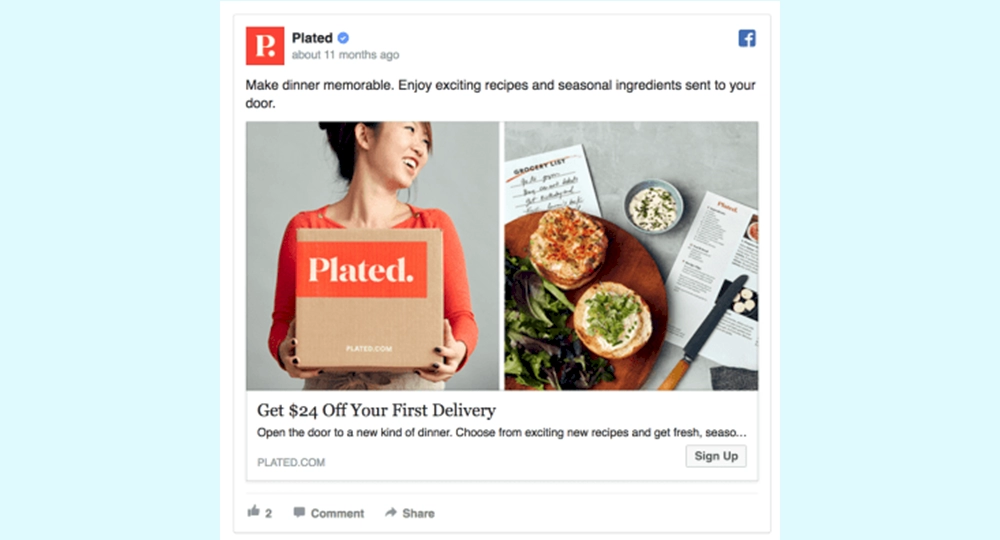
The “before and after” technique follows the “knowledge gap” theory that George Loewenstein proved in the 90s : The curious individual is motivated to obtain incomplete information in order to reduce or eliminate the feeling of deprivation.
If you show before and after images, users will start spending more time with your ads while their brains develop the missing parts of the story.
⭐However, not all “before and after” ads are endorsed by Facebook. According to Facebook’s Advertising Policies: “Ads” must not contain “before and after” images or images that do not contain unexpected or potential consequences. Advertising content should not imply or attempt to imply a negative self-perception to promote diet, weight loss or other health-related products. ”
Facebook Ad Design Tip #14: Tell Better Stories with Carousel Ads
A report by Kinetic Social states that carousel ads are 10x better at getting people to click, compared to static sponsored posts on Facebook.
While I’m convinced that Carousel ads have a 1000% higher ROI than regular ads, this type of ad can help increase CTRs to some extent.
Carousel ads allow you to add up to 10 consecutive offers to showcase your product or tell a story.
Hired has used the carousel ad format to appeal its Facebook ads to a number of developers.
Facebook Ad Design Tip #15: Use Carousel Ads to Show the Process
If you work for a SaaS company, you can set up a carousel ad that shows the various steps of the registration process.
If you offer a subscription service, you can guide people through the subscription and distribution stages.
How to create awesome click-through carousel ads:
- Tell a coherent story throughout the slide show
- People are so good at the first slide of your ad that they want to see the others.
- Add a clear call to action at the bottom of each slide
Facebook Ad Design Tip #16: Make Sure Your Creatives Are Unique
If you’re working with dozens of different ad designs in a short amount of time, make sure they all look credible and of high quality.
Never compromise high quality over quantity.
As a star in Facebook ad images, it can be worth 10x more than five low-quality images. Take MailChimp’s ad:
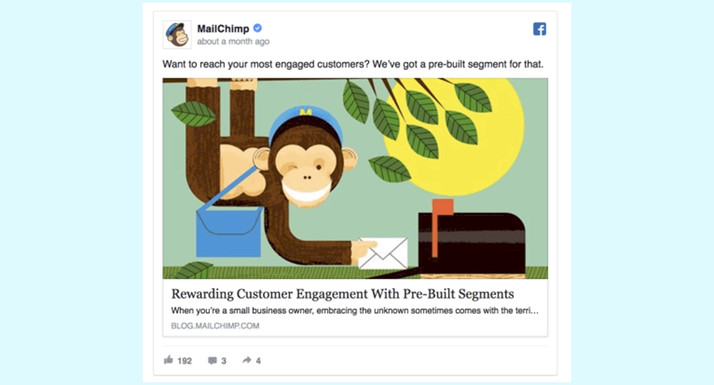
Avoid using stock photos, especially free ones. People are tired of seeing the same images over and over in their newsletters.
Facebook Ad Design Tip #17: Use a Color Layer to Create a Branded Image
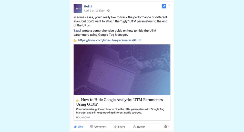
If you’re looking for a quick way to create Facebook and Instagram ad designs that set you apart, you can check out Holini.
They always add a light purple layer to their blog images. This way, their content is easily recognizable and they can use free stock photos as a background layer.
Facebook Ad Design Tip #18: Be Consistent With Your Ad Designs
If you want to take advantage of increased brand awareness as well as sales, try to keep your ad designs consistent over time.
That doesn’t mean you can’t test a variety of colors or different types of images. However, try to keep at least some creatives in place.
- Keep fonts and foreground the same if you want to test different background colors
- If you plan to test animated images and stock photos, keep the colors close to those on your website.
- Keep the background unchanged if you are testing various in-image messages
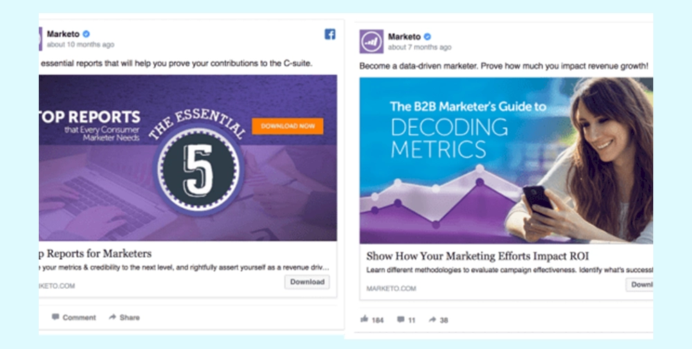
For example, Marketo always uses its branded colors purple in ads:
AdEspresso’s Facebook ads always feature brand mascots, making the ad image instantly recognizable in the news feed.
NewsCred’s study found that 62% of Millennials think online content increases their loyalty to a brand. For Millennials, the most important driver of brand loyalty is a great product at 77%. This is followed closely by brand recognition and trust with 69%.
Making brand awareness one of your Facebook advertising goals will pay off in the long run as people become more and more familiar with their products.
Facebook Ad Design Tip #19: Match Ad Designs to Landing Pages
When you click on an ad featuring delicious ice cream and land on a website that sells dog food, you probably feel pretty negative about the deceptive ad.
Getting people to click on your ads is only half the victory. You also need to get users to shop from your landing page.
We’ve seen conversion rates increase by 20-35% as I closely match my ad designs with landing pages.
Here is an example of a Facebook ad image for you:
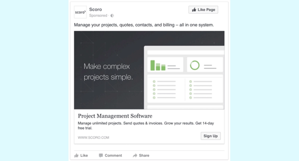
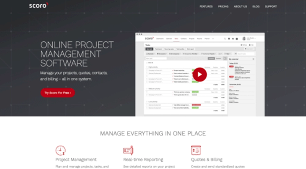
Note how exactly the background of the ad matches the landing page:
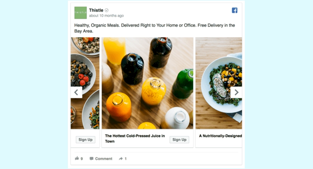
Of course, you can find other examples on this subject. Take a look at Thistle ‘s Facebook ad and landing page:
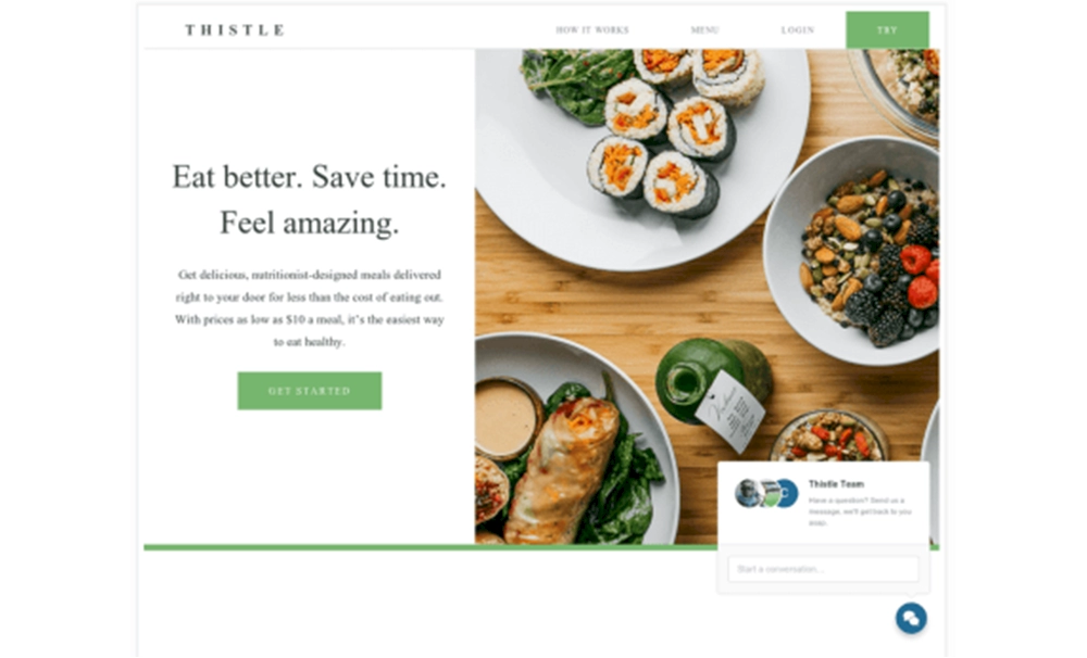
Don’t forget to also match ad bids with landing pages to increase conversion rate.
Facebook Ad Design Tip #20: Replace Static Images with Video Ads
When analyzing the ROI of video ads, Kinetic Social found that video ads have the lowest eCPC, with an average eCPC of $0.18.
- The first 5 seconds are the most important – you need to grab people’s attention right away so they can watch the rest of the video.
- Videos work well with complex products and give you a chance to explain all the advantages of your product
- Adding subtitles to your video increases view rates. According to Facebook , captioned video ads increase video view time by 12% on average.
You can promote a video of your product or share branded video content like Adidas does:
⭐Tip: Keep your videos short. Wistia discovered that on average, people watch more than 80% of the video in less than 30 seconds. However, as the video length increases, engagement decreases.
Facebook Ad Design Tip #21: Add Discount Offers to Ad Images
If you’re running a Facebook or Instagram campaign offering a discount, make sure users notice the offer as soon as possible.
For example, MOO’s Facebook ad features a large yellow “25% off” sign in the ad image, making their offers clearly visible.
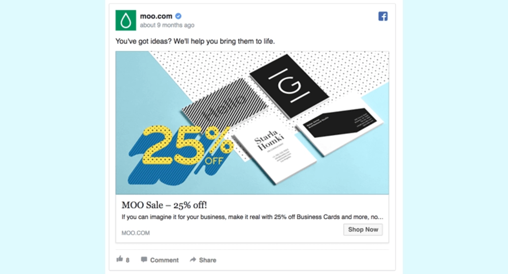
How to create better discount offers for your Facebook ads:
- Promote limited time offers, flash sales, limited stock items.
- Define clear dates like “Today only” or “Offer ends in 24 hours” to create a sense of urgency
- Offer a significant discount, for example “Get 25% off today”
- Match your ad’s bid with your landing page
- Place your discount offer in the headline or image of your ad
Facebook Ad Design Tip #22: Add a Simple and Calling Message
A/B testing found that when testing Facebook ads on Scoro, an ad with a “Sign Up” CTA performed 14.5% better with a “Learn More” CTA.
There are two main reasons for this:
- “Sign up” CTA matched offer on our landing page
- Users who clicked the “sign up” CTA were more willing to sign up than those who wanted to learn more
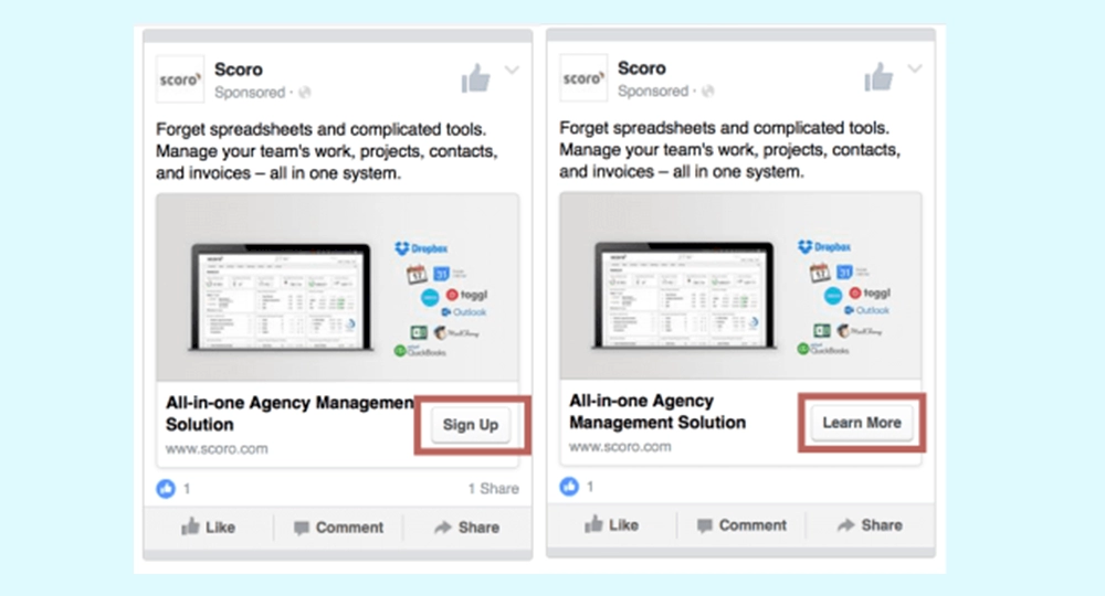
Don’t overlook your recent Facebook advertising goal conversions when creating ad designs. While people are more likely to click on low-threat CTAs like “Learn More”, they will convert at a higher rate after clicking the “Sign Up” CTA.
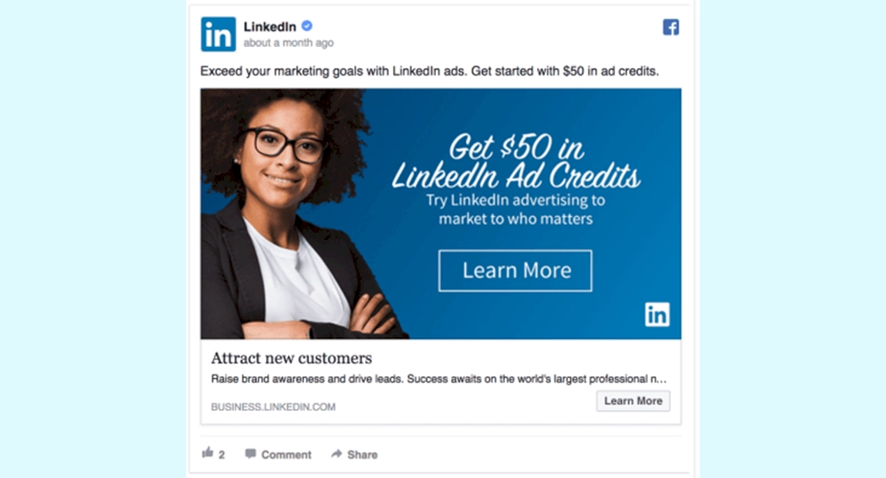
Test adding a call to action to draw more attention to the action you want the ad viewer to take. Let’s take a look at a good example from LinkedIn :
Facebook Ad Design Tip #23: Use GIFs Instead of Images
In early 2017, Facebook announced that it now allows advertisers to use GIFs as ad images.
There are still many people who have no idea about it, you can use this Facebook ad hack to your advantage.
In fact, on this topic Buffer has put together a great guide for creating your own GIFs .
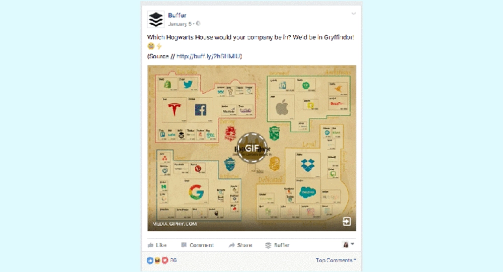
How to create a Facebook ad with an animated GIF:
- Create a Facebook ad campaign in Ads Manager
- Instead of choosing a picture of your ad, choose a GIF that you can upload to the Videos section
Facebook Ad Design Tip #24: Use a Place-Appropriate Image
There is one simple rule that applies to all Facebook ad campaigns. The more relevant your ads are to the target audience, the more their conversions will be.
Location-specific Facebook ads take relevance to the next level.
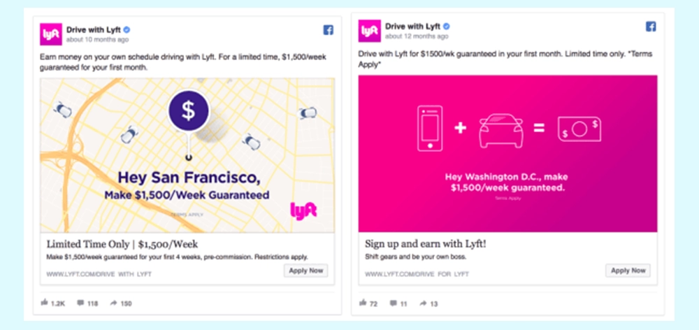
By mentioning specific cities in the ad images, Lyft can grab more people’s attention. Because users will immediately find the ad as relevant as it mentions their location.
Mazda has created dynamic ads based on geographic radius to target people who are likely to go to a specific Mazda dealership.
The results were surprising: Visitors who saw these ads converted at a 53% higher rate than the control group.
⭐Tip: Make sure your location-specific audience is large enough to justify the extra time you spend creating new location-specific ads.
Facebook Ad Design Tip #25: Avoid Ad Fatigue by Rotating Ads
Imagine that you are logged into your Facebook Ads Manager account and the performance of the campaign has dropped by 50% compared to two days ago.
What happened?
This scary marketers nightmare is called Facebook ad fatigue . It is the moment when the target audience is tired of seeing your ads.
AdEspresso’s analysis shows that the cost-per-click of Facebook ads increases by more than 45% on the second ad view and by more than 120% after a person sees the same ad 6 times.
So how can you prevent your ad designs from becoming old news?
⭐One tip you should definitely try: Change ad designs so your audience will see a different ad design every few days.
It works like this:
- Create 3-5 ad sets with different ad designs
- Schedule each ad set to be active on different weekdays
You no longer have to worry about the audience seeing the same ad design over and over again. They will only see each design a few times, extending the life of the Facebook campaign by several weeks.
As a result
I have come to the end of all my suggestions. Did you find this guide helpful?
Remember that social media networks have become an area that attracts the attention of many people day by day. Because too many people around the world use these networks, brands take their place here. In this case, Facebook has definitely become the most preferred place for brands. Although other social networks come into play, Facebook will never lose its power. There are people from absolutely every target audience class in its target audience, and brands love to use this wide range of target audiences.
This is where Facebook Ad Images come into play. The more attention-grabbing and accurate visual you use, the more positive feedback you can see.
Have you used the suggestions in this guide before?
If you started using it after this guide, share your results with us.
You can register on our site to increase your Facebook accounts and increase your followers, likes, views and subscribers. Click here to see our social media products.

